BRANDING
Who we are. How we serve. The impact we create for our clients, members, colleagues, and partners.
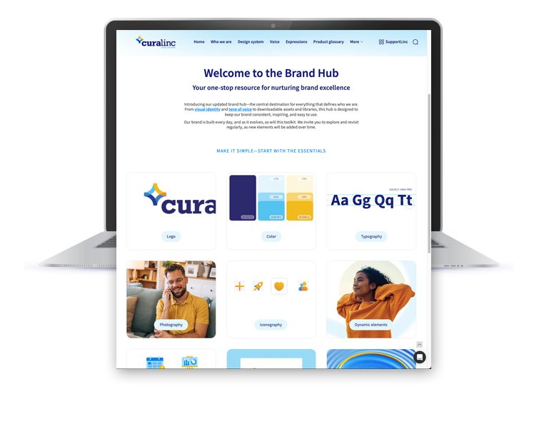
CuraLinc Healthcare Brand Guidelines and Toolkit
Evolve, define, and bring the brand's visual identity to life.
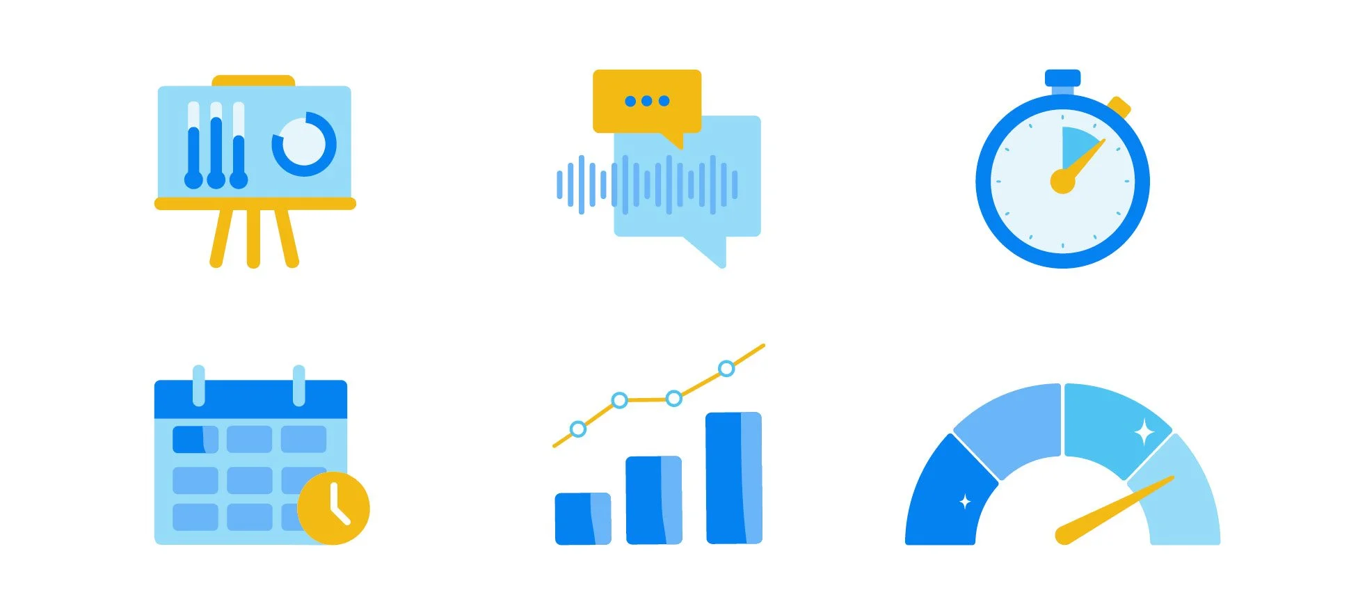
The CuraLinc brand needed updated icons, pictograms, and photos, along with brand guidelines, for a user-friendly platform that enables easy access and version control.
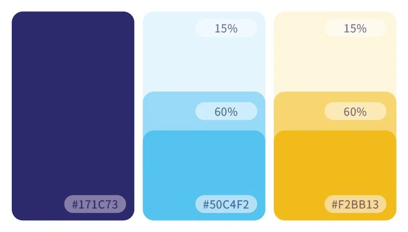
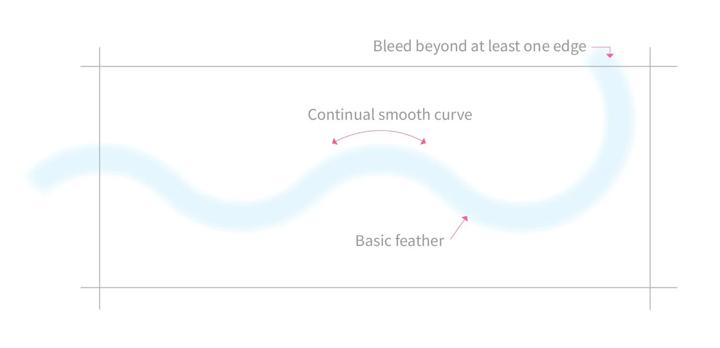
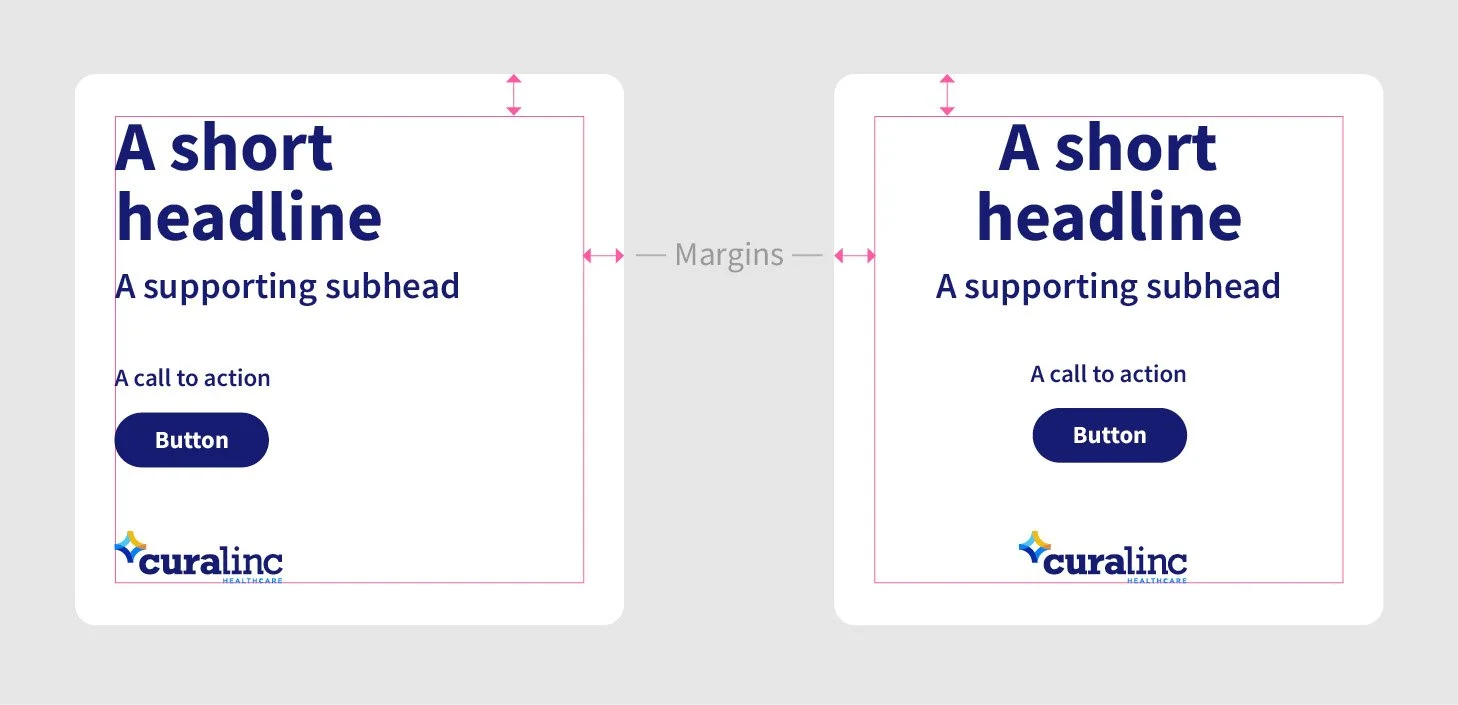
PROCESS: I initiated the development of the new assets and brand guidelines by gathering input from key stakeholders and conducting a thorough review of the existing brand materials. I created new icons and pictograms, and defined and documented the use of dynamic elements and toolkit library assets. Then, I created a structured outline of the guidelines that encompassed essential elements, including logo usage, color palette, typography, photography, and the newly designed icons.
To ensure user-friendliness, I used Frontify, a digital asset management platform that provides an intuitive layout, easy navigation, and search functionality. Throughout the creation process, I incorporated visual examples and interactive elements to enhance understanding and brand identity.
Collaborative feedback sessions were held to refine the guidelines further, ensuring they met the needs of internal teams.
RESULTS: The result was a clear, cohesive set of brand assets and guidelines that were easily accessible on a user-friendly platform that promotes consistency across all communications and marketing efforts.
Feedback from team members indicated a significant increase in confidence when using brand assets, resulting in more consistent and aligned brand representation across all materials. The platform also streamlined the onboarding process for new employees and external vendors, facilitating a quicker understanding of the brand identity.
Barnes Group
Benefits logo & website
When the Barnes Group updated their brand guidelines, it was time to refresh their employee benefits materials.
PROCESS: I brainstormed names to create the “Next 360” logo in an effort to illustrate Barnes’ passion and drive to help employees pursue their best, healthiest self.
Next, I provided art direction to the web development team: updating color palettes, font usage, iconography, photography, banners, navigation rollovers, tiles, etc.
RESULTS: “Wow what an improvement, this is an instant upgrade! Much more modern and the updated icons are a great addition.”
Corporate
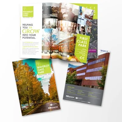
Investment sales and leasing
Product launch
Marketing. Branding. Digital. Print
Let’s get creative.

